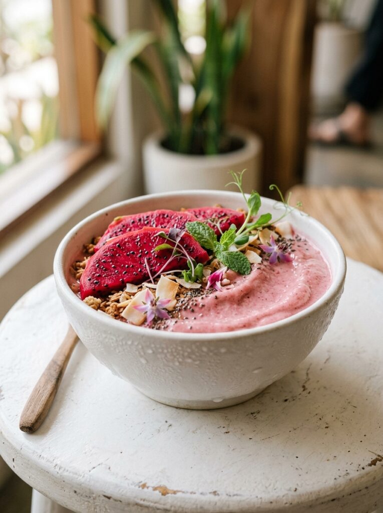
My sister called me ridiculous last summer. I’d been standing at the kitchen counter for about four minutes deciding whether to put the granola on the left side of the bowl or scatter it across the top. The smoothie itself? Already perfect. Thick, cold, exactly the right shade of rosy purple. But I wasn’t done yet.
She doesn’t get it. You might.
—
1. Why Your Smoothie Looks Sad (and It’s Not the Recipe)
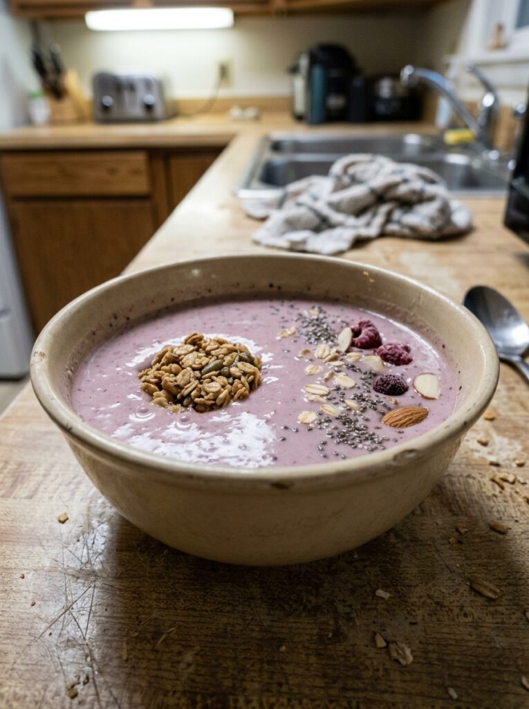
Here’s the thing nobody says out loud: most home smoothies look defeated. Grey-ish. Foamy on top. Poured into whatever cup was nearest the front of the cupboard. And it’s not because the ingredients were wrong — it’s because nobody thought about what was going to happen AFTER the blending stopped.
The smoothie aesthetic isn’t about being precious. It’s about the two-second pause before you drink something where you think, oh. That looks good. That one small moment changes the whole experience. I know it sounds like a lot but honestly it takes maybe three extra minutes and the payoff is completely disproportionate.
Foam is the first problem. When you blend on high for too long, air gets whipped in and that pale, bubbly layer settles on top like the smoothie gave up. Blend until smooth and then stop. Not for another ten seconds “just to be sure.” Done.
The second problem is colour. Some combinations are beautiful — frozen mango with turmeric, anything with frozen cherries, spirulina in a banana base. Other combinations turn brown and there’s not much saving them aesthetically. More on that.
—
2. The Colour Combinations That Actually Photograph Well (and the Ones That Don’t)
Not gonna lie, I’ve poured smoothies straight down the sink because they turned an unforgivable greige. You live, you learn.
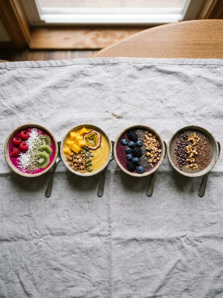
The colours that work: deep berry purples, coral-y pink (strawberry or watermelon based), vibrant orange (mango or carrot forward), pale jade green (cucumber or fresh spinach, not frozen — frozen spinach goes army green), and bright yellow. These are the ones that look luminous against a white bowl or a pale wooden board.
The ones that fight you: anything mixing blueberries AND spinach in equal measure (swampy), anything with too much cocoa powder and not enough contrast, or — this is a very specific mistake I made — pomegranate plus avocado. Just. Don’t.
“Colour is doing about 60% of the work before anyone even picks up a spoon.”
If you’re starting out and want guaranteed visual results, go monochromatic. All pink. All orange. All green, properly done. Keeping one colour family means you can’t really go wrong, and the toppings become the contrast instead of the smoothie itself trying to do everything.
Quick note for UK readers: frozen tropical mixes from the supermarket freezer aisle are your best friend here. Cheaper than fresh, just as vibrant, and they thicken without ice (which would water down the colour).
—
3. The Thickness Rule That Nobody Talks About Enough
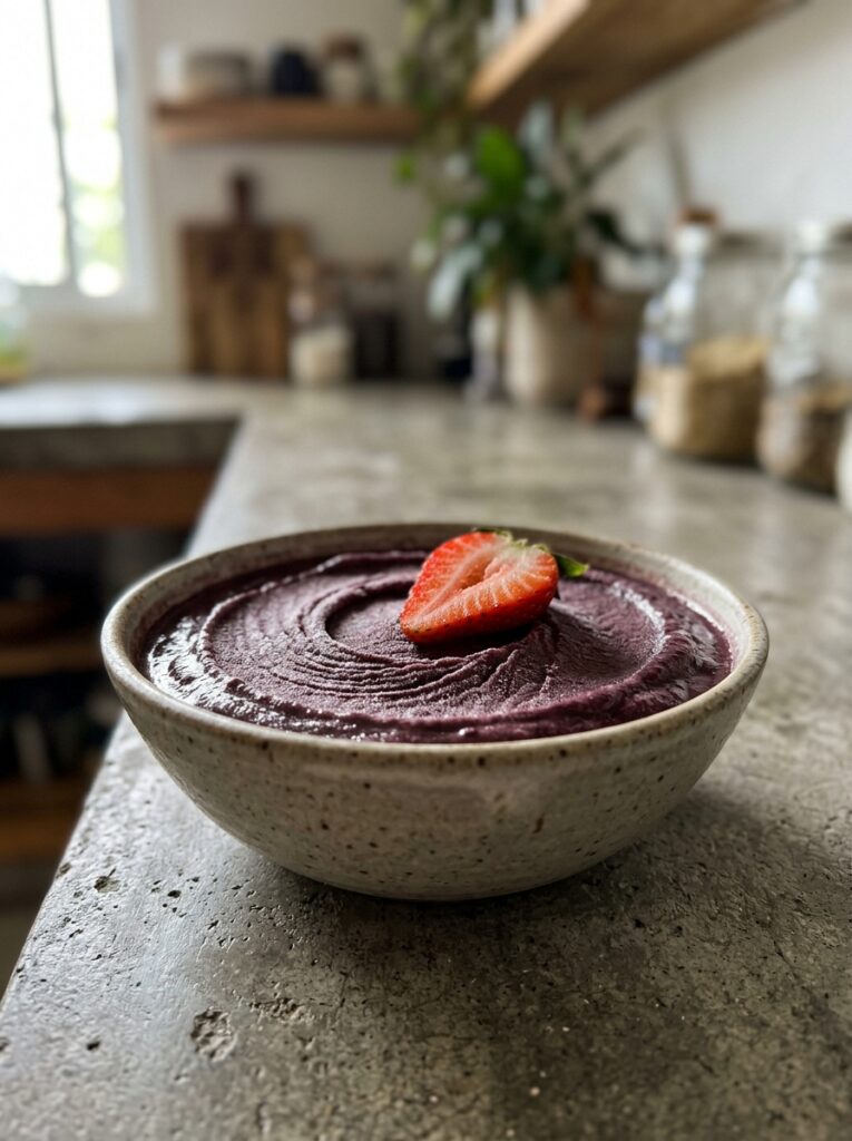
A pourable smoothie is fine for a glass. But for bowls, for photos, for that spoonable density that looks like something between ice cream and yogurt? You need it thick enough to hold a topping without everything sinking in three seconds.
The trick isn’t always adding more frozen fruit. Sometimes that makes it icy and crystalline rather than creamy. What actually works is frozen banana as a base — half or a whole one — combined with a really short blend time and minimal liquid. Start with two tablespoons of liquid. I’m serious. Add more only if the blender is struggling.
A good thickness test: tilt the blender jug. If the smoothie moves slowly, like it’s reluctant, you’re there. If it slides around, add more frozen fruit or a small cube of frozen yogurt.
For glass smoothies, you actually want it a little thinner than you think. The aesthetic for a glass is different — it’s about layers, about seeing colour through the glass, about the satisfying way it moves when you pick it up. Different goal entirely.
—
4. The One Bowl Shape That Makes Everything Look Better
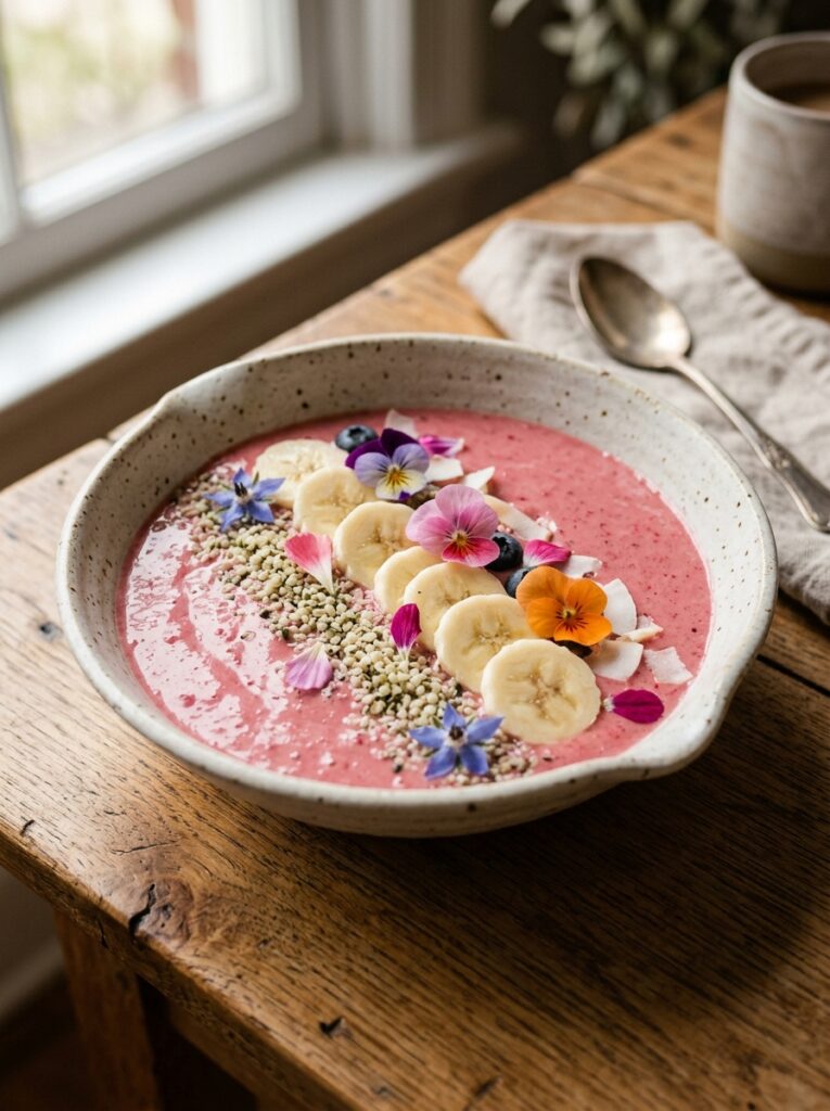
Wide and shallow. That’s it. That’s the whole tip.
A narrow bowl forces your toppings into a cramped vertical pile. A wide, shallow bowl gives you a canvas. The smoothie becomes the background, toppings become the design. You can do rows, you can do clusters, you can do the artful “thrown on with intention” look that takes about thirty seconds but photographs like you planned it for an hour.
Matte ceramic works better than glossy for photos, in natural light especially. White or off-white reads clean. Earthy terracotta gives warmth, especially with orange or tropical smoothies. I have a pale sage green bowl I reach for with berry smoothies specifically because the contrast just sings.
Side note — if you’re in the UK, charity shops and car boot sales are honestly incredible for interesting ceramic bowls. You’ll find shapes you’d never buy new, at prices that make the whole thing feel low-stakes enough to actually experiment.
—
5. Toppings That Look Like You Tried Without Trying
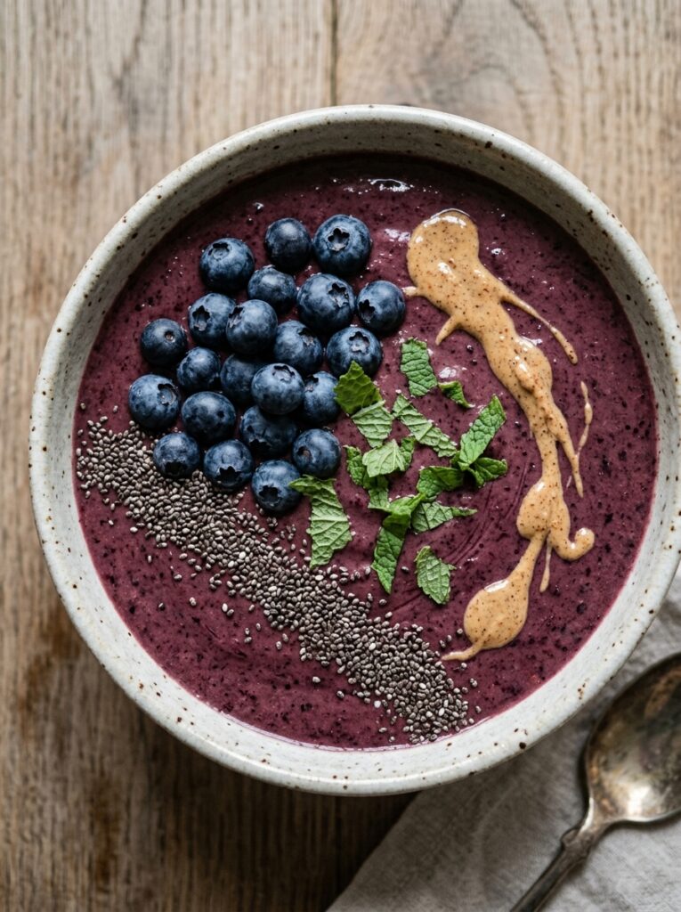
This is where most people go wrong in both directions. Either they throw on a random handful of granola and call it done (no shame, but also no visual interest), or they go so elaborate it looks like a still life and you can’t imagine actually eating it.
The sweet spot is what I call “three types, two textures.” Something crunchy, something creamy or soft, something that adds a colour pop. Granola, a spoonful of nut butter, a few fresh raspberries. Hemp seeds, sliced banana fanned out, a drizzle of honey. Toasted coconut, frozen blueberries (they frost beautifully), a few cacao nibs.
“The best topping combinations look effortless because they follow a structure even when they don’t look like it.”
Edible flowers, if you can find them, are genuinely transformative for photos. But I know that’s not always accessible or affordable, so fresh mint and thinly sliced fruit do a lot of the same visual work. A curl of orange zest over a mango smoothie. Half a fig pressed cut-side up into a berry base. The small specific choices.
One thing I’ve learned: odd numbers look more natural. Three raspberries, five granola clusters, seven hemp seeds roughly spread. Even numbers look like you counted them. Nobody wants to look like they counted.
—
6. The Light Situation Is More Important Than Your Blender
Honestly. A £20 blender in good light will photograph better than a £200 one in bad light every single time.
North-facing windows are the gold standard — soft, diffused, no harsh shadows or orange warmth. East-facing windows work great in the morning. That window light at 8am in summer? Ridiculous. Direct sunlight through a south-facing window usually blows out highlights and creates distracting shadows that cut across your bowl at weird angles.
If your kitchen doesn’t have great light, a white piece of card or foam board opposite the light source bounces light back onto the shadow side of your bowl and lifts the whole image. It’s not a professional setup. It’s a piece of card. And it works.
Also — phone cameras handle smoothie bowls better when you shoot straight down, not at an angle. The full bowl geometry reads clearly from above, the toppings make the most sense, and the bowl shape frames everything. If you’re shooting a glass smoothie, a slight angle at counter level shows the layers better.
—
7. That Specific Shade of Purple Everyone’s Blending Right Now
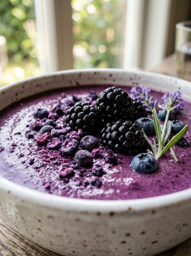
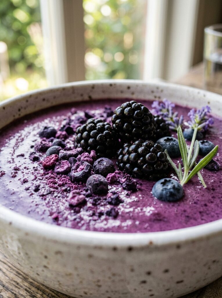
Okay so if you’ve been on any recipe-related corner of the internet in the past year and a half you’ve seen this colour. A deep, slightly muted purple-blue. Almost like blueberry jam mixed with a bit of lavender. It’s everywhere and it’s everywhere for a reason: it photographs BEAUTIFULLY and it somehow goes with every kitchen surface.
It usually comes from a combination of frozen wild blueberries and frozen acai, sometimes with a touch of frozen blackberries. The wild blueberries are key — they’re smaller, darker, and more intensely pigmented than the cultivated ones. If you can find them frozen (they’re more common in the US but increasingly available in UK supermarkets), they’re worth seeking out.
For the recipe itself: about a cup of frozen wild blueberries, a tablespoon of acai powder (or an acai pack), half a frozen banana, a splash of oat milk. Blend short. The colour should stop you. That’s how you know you’ve got it.
—
8. Why Green Smoothies Are the Hardest Aesthetic (and How to Win Anyway)
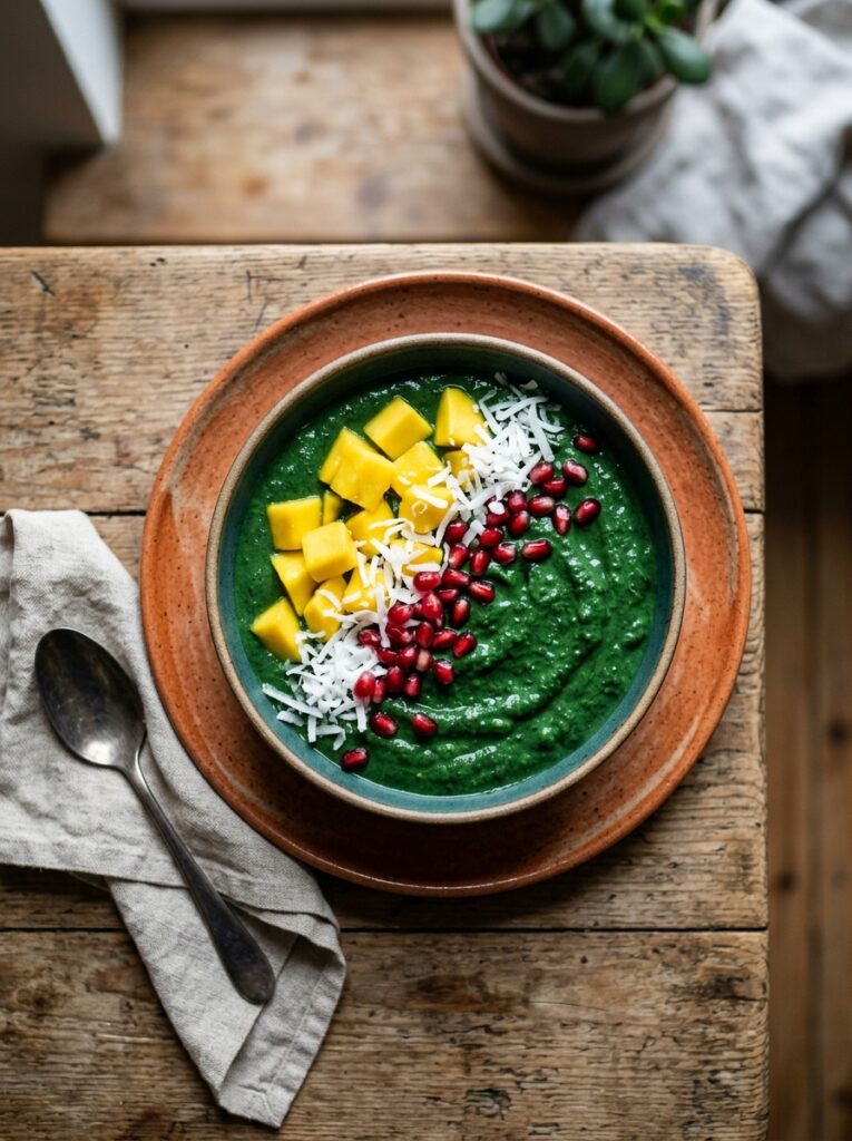
Green is the most complicated colour to make look appealing in food photography. Our brains are wired to be a little skeptical of green drinks — evolutionary hangover from the days when bright green things were potentially suspect, I suppose. So green smoothies have to work harder.
The shade matters enormously. A bright, almost neon jade green reads as fresh and exciting. An olive or army green reads as… not that. The difference is usually the type of greens (fresh spinach vs frozen, or using cucumber for brightness) and avoiding over-oxidation by drinking/photographing promptly.
The other thing that saves green smoothies aesthetically is contrast toppings. Go bold with colour on top — sliced strawberries on green looks stunning. Golden kiwi rounds. A scattering of pomegranate seeds. Let the bowl itself be the “healthy” signal, and let the toppings bring the visual joy.
“A green smoothie that looks beautiful is basically an optical argument that healthy and gorgeous aren’t opposites.”
White bowls specifically do green smoothies a lot of favours. There’s nowhere to hide, but there’s also nothing competing.
—
9. The Layered Glass Smoothie (It’s Easier Than It Looks, I Promise)
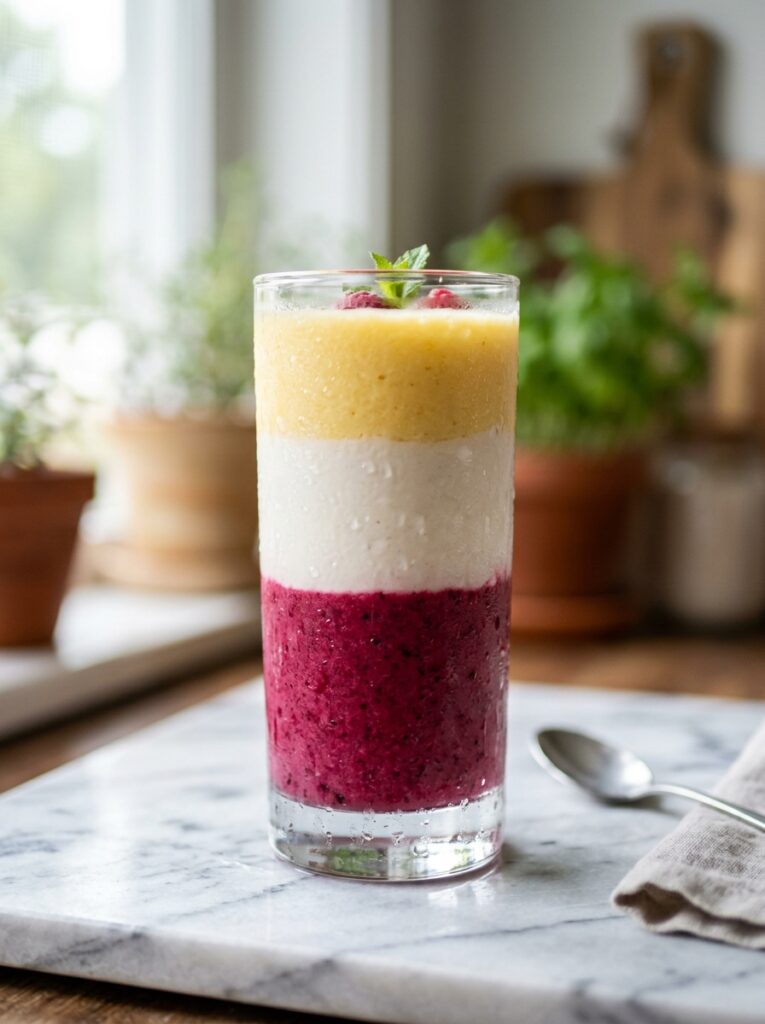
Two colours, poured carefully, don’t mix as much as you’d think — especially if the bottom layer is thick and cold. The trick is pouring the second layer slowly over the back of a spoon so it flows gently across the top without punching through.
Classic combinations that layer well: mango base, passion fruit top. Strawberry base, banana top (pink and cream — gorgeous). Dragon fruit base, coconut top. Spinach-banana base, mango top — the green to orange gradient is actually one of the most beautiful things you can make in a blender.
Glass matters here. Clear is obviously necessary, but a slightly textured glass or a vintage-style glass with some slight imperfection shows the gradient better than a perfectly smooth surface. Something about the texture helps each layer read distinctly.
I’ve found that using a straw in layered smoothie photos actually helps composition — it gives the eye something vertical to follow, and it suggests the drinking experience, which makes the whole image more appealing somehow. A metal or glass straw rather than plastic, if you’ve got one.
—
10. Prepping Smoothies Ahead Without Ruining the Look
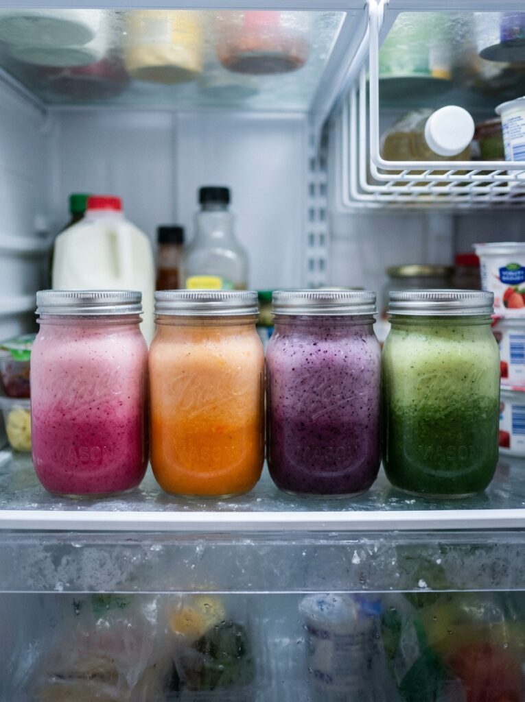
Smoothie packs. Game changer, boring name.
Measure out your fruit, your greens, any powders into a zip bag or small container, freeze it, done. In the morning you dump it in the blender with your liquid and blend. Takes ninety seconds. But — and this is key for the aesthetic — you need to think about colour at the packing stage, not the blending stage.
Some combinations change colour slightly after freezing, so if you’re packing a bag based on something you made fresh, freeze a test batch first and see if the result is what you expected. Spinach tends to go a little darker. Mango stays true. Fresh strawberries can go slightly more muted than frozen ones.
The aesthetic doesn’t have to be spontaneous. It can be planned in advance on a Sunday afternoon, with a podcast on, measuring things into freezer bags. In fact, I think that version is kind of better — you’re not scrambling at 7am, you’re executing something you already designed.
—
11. The Kitchen Background Is Part of the Photo
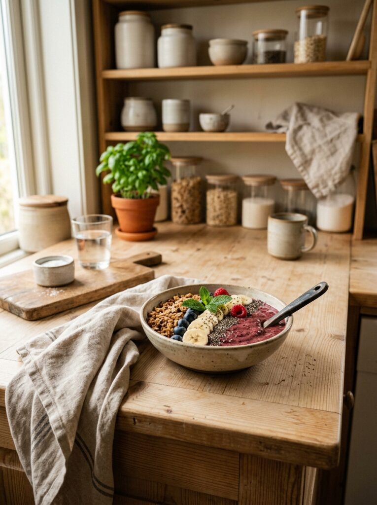
This sounds obvious when someone says it out loud. But it’s easy to forget when you’re excited about the bowl itself.
The surface matters. A worn wooden chopping board, a piece of marble-look board, a linen tea towel underneath — each of these does different work. Marble reads clean and high-end. Wood reads warm and lived-in. Linen reads natural and kind of rustic. None is wrong, all are intentional choices.
Clear the background. This is the one I always have to remind myself of — shove the oil bottles and the fruit bowl and the random envelope out of frame. Not because minimalism is objectively better, but because visual clutter competes with the food and the food should win.
A loose herb sprig, a second smaller bowl with just fruit in it, a whole banana resting casually alongside — these additions that look incidental are doing a lot of compositional work. They lead the eye toward the main bowl. They suggest abundance without chaos.
—
12. Making It a Habit Instead of a Whole Production
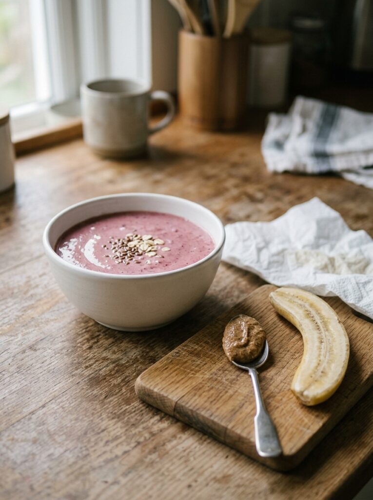
Because here’s the honest version: I don’t do the full smoothie aesthetic setup every single morning. Some days it’s a glass, it’s fine, it’s breakfast. But the days I do take the extra few minutes? They feel different. Not because of the photo. Because of the making of it.
There’s something about arranging toppings carefully, choosing a bowl that feels right, checking the light before pouring — it’s a small act of intention at the start of the day. And I think that’s actually what the smoothie aesthetic is really about, more than it’s about Instagram or Pinterest or any of it. It’s a few minutes of making something deliberately beautiful for yourself.
Which is not nothing.
—
❓ FAQ
Q: How do I stop my smoothie bowl from getting watery and sad after a few minutes? A: Keep your toppings dry before adding them and serve immediately after blending. If you’re photographing it, work quickly — the cold surface of the smoothie starts condensing and releasing moisture within a few minutes, especially if your kitchen is warm. Eating it straight after photographing (not leaving it to melt while you edit) keeps both the look and texture at their best.
Q: Why does my smoothie always turn grey instead of the colour in the recipe? A: Usually it’s one of two things — you’re blending for too long and incorporating too much air, or you’ve mixed colour families that cancel each other out (red and green together, for example). Try blending for a shorter time and checking your fruit combinations before you commit. Sometimes just adjusting the ratio of one ingredient makes a big difference to the final colour.
Q: Can I make a visually nice smoothie without buying special powders and superfoods? A: Absolutely. Frozen berries, banana, and a splash of any milk is all you need for a beautiful purple or pink smoothie. The powders (acai, spirulina, pitaya) are helpful for intensifying colour but they’re far from required. Natural fruit pigments are genuinely stunning when you start with quality frozen fruit and don’t overthink it.
—
💭 Final Thoughts
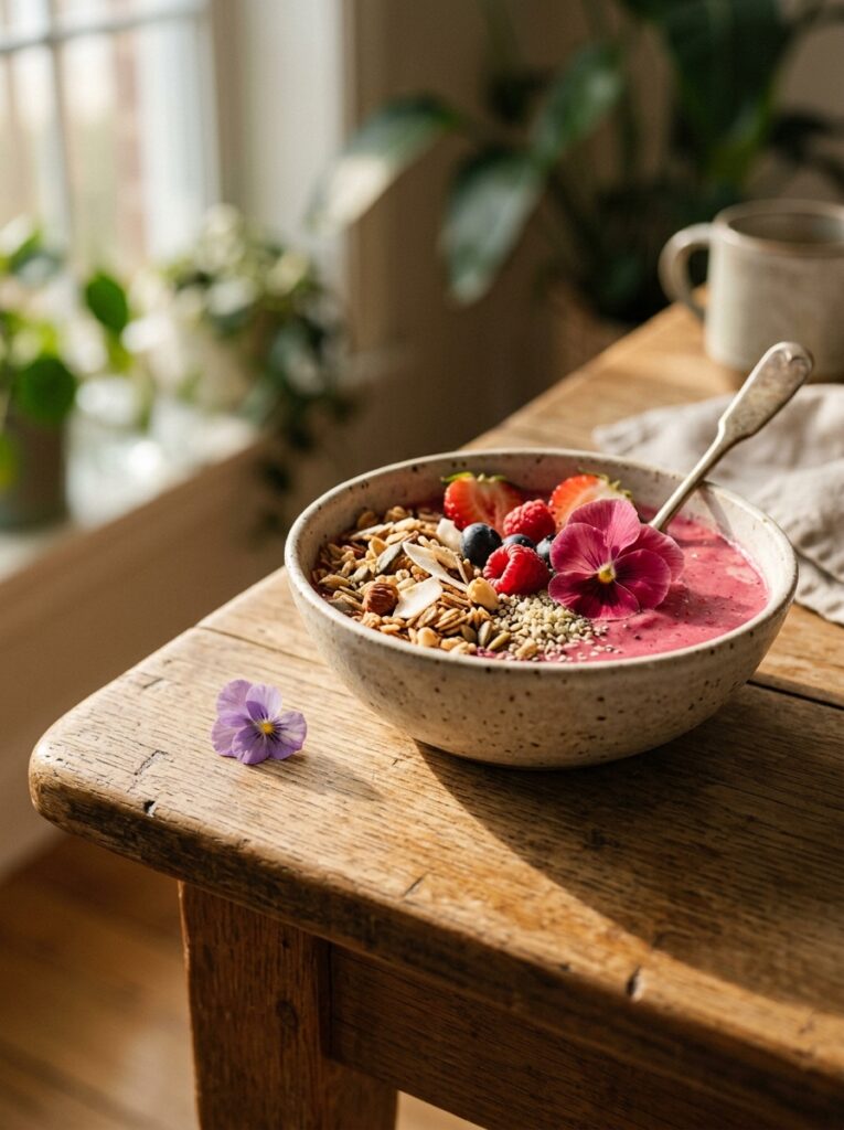
There’s no wrong way to make a smoothie, obviously. But there’s a version of this that takes three more minutes and makes the whole morning feel like something you chose, not just got through. That’s what I keep coming back to — not the perfect photo, but the pause before drinking something that looks exactly like you wanted it to.
What would your ideal smoothie aesthetic actually look like, if you sat down and thought about it for a minute?
